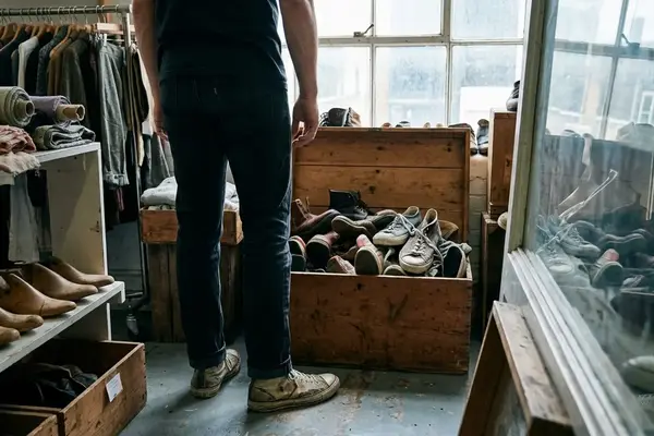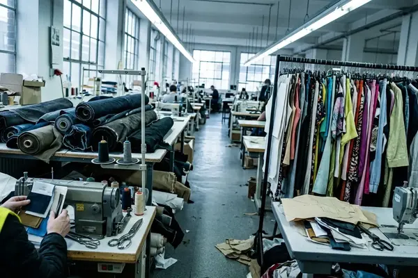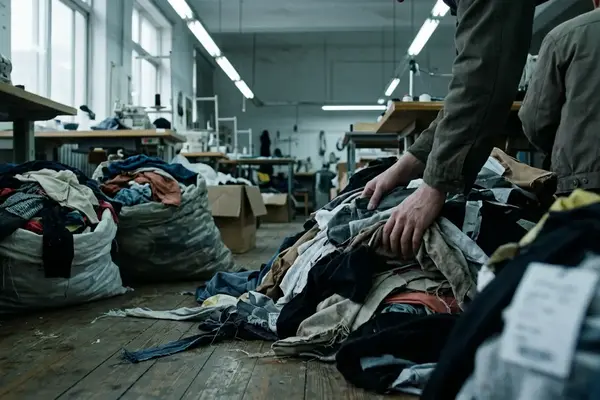

The collaboration has become streetwear’s default unit of attention. Every week brings another shared wordmark, borrowed archive graphic or familiar silhouette dressed in a partner’s palette. The rhythm keeps product moving, yet it has flattened the distinction between a genuine design encounter and a scheduled exchange of logos.
Collaboration—once treated as a cultural event, now sits inside the ordinary mechanics of seasonal retail. To understand where the format still works, we have to get past launch-day noise and inspect the object itself: pattern, material, closure, load, movement and the reason two names appear on one label.
In this Article
- Log 01: The Relentless Drop Calendar
- Log 02: Navigating the Sea of Logos
- Log 03: Dead Zones and the Absence of Utility
- Log 04: Finding True North in Design
- Log 05: The Horizon Line of Menswear
Log 01: The Relentless Drop Calendar
Monday morning: a retailer newsletter announces a footwear capsule. By Wednesday, campaign posts reveal matching bags and small accessories. Friday brings the outerwear, presented as though the entire proposition arrived fully formed that morning. In the showroom, these releases occupy neighbouring rails, each asking to be read as an isolated moment of cultural importance.
We built the log from release calendars, retailer newsletters, showroom line sheets and campaign posts, grouping every announcement into Monday-to-Sunday blocks across the Spring/Summer 2025 and Autumn/Winter 2025 selling windows. Footwear, outerwear, jersey, trousers, bags and small accessories were separated so that a single campaign crossing several categories did not masquerade as several independent partnerships.
The result is a weekly cadence rather than the occasional collision of distinct design worlds. Collaboration now functions as a routine retail expectation, useful for refreshing an established product without carrying the cost or uncertainty of developing a new proposition from the sole, block or fibre upward.
That pressure changes the work. A rare partnership can afford strangeness because its difference supplies the event. A crowded calendar rewards immediate recognition: two logos, one legible reference and a silhouette the customer already knows. The release must explain itself before the thumb reaches the next post.

Market saturation therefore appears first as visual repetition, but its deeper effect is temporal. Products receive too little quiet attention for construction to become the story. The next announcement arrives before anyone has worn the previous one through rain, public transport and a full day on foot.
Log 02: Navigating the Sea of Logos
The central failure is easy to locate: many partnerships alter recognition while leaving design untouched. A badge moves to the chest. A monogram repeats across a lining. Contrast stitching appears around the same pocket geometry used in the main collection. The product announces two authors, though its construction reveals only one familiar template.
Reading Without Names
Our editorial review covered seasonal lookbooks and retail releases published across the 2024–2025 selling year. Each garment was read first with the campaign copy and partner names hidden. The sequence moved from silhouette at full-body distance to fabric, seams, closures and interior labels. We looked for altered pattern blocks, unfamiliar fastening systems, changed pocket geometry and purpose-built material choices. A colour substitution alone did not qualify as structural development.
This method has a defined edge. It is less decisive for collaborations rooted in graphic art, record culture or community fundraising, where image authorship may carry the central contribution. Prominent graphics can hold real cultural weight. An FC St. Pauli piece, for example, may derive its meaning from the German football club’s local scene and visual codes rather than an adventurous sleeve block.
Logo Collision
Hide the branding and ask what remains identifiable. A productive partnership should leave evidence in the silhouette, material system or way the product is used. If every distinctive feature disappears with the wordmarks, the garment is carrying a campaign rather than an idea.
Consider a hypothetical Mitchell & Ness jacket cut from wool flannel. Heritage typography and a period fabric can establish a coherent visual register, but they do not automatically create design tension. The harder questions concern weight distribution, shoulder mobility, lining, pocket access and how the cut behaves over contemporary layers. Cultural citation supplies the vocabulary. Construction decides whether anyone has said something new.
Log 03: Dead Zones and the Absence of Utility
On the rail, a co-branded shell can look technical. Oversized zip pulls, exposed hardware and decorative webbing create the impression of equipment. Put a backpack over it and the webbing catches beneath the straps. Load the pockets and the pulls collide. The visual language promises movement while the physical object obstructs it.
These are the market’s dead zones: products designed intensely at the surface and casually at the points where bodies meet cloth. They often photograph well because photography rewards outline, contrast and detail density. Street use asks different questions.
- Can the jacket close over a medium-weight sweatshirt without locking the shoulders?
- Do the cuffs, hem adjustment and hood remain usable in both light and layered configurations?
- Can a wearer reach the pockets while carrying a backpack?
- Do trousers hold their line when seated, and are the knees shaped for movement?
- Does footwear decoration survive repeated toe flex?
- What happens when a screen print crosses a side seam or pocket opening?
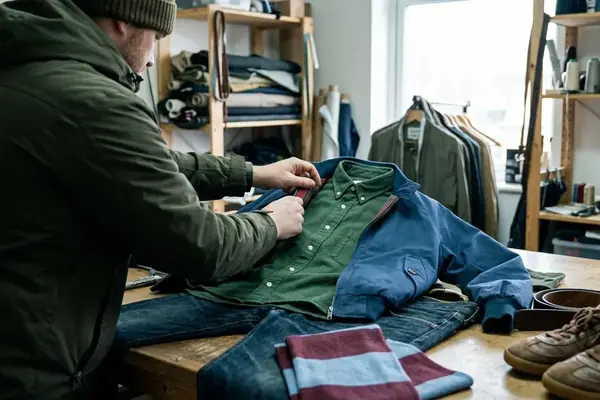
The physical check follows garments from rail to street. Outerwear goes over a T-shirt and then a medium-weight sweatshirt. Trousers are loaded, sat in and moved through a full range at the hips and knees. Jackets receive particular scrutiny where backpack straps rub. Printed and bonded decoration must behave like part of the garment instead of packaging applied to it.
Wear It Loaded
Test pockets with the objects they imply: phone, keys, wallet or gloves. Close every fastening, raise both arms and sit down. Utility becomes visible under load, especially where campaign styling has kept the product empty and perfectly arranged.
A marketing narrative may describe urban movement, protection or modular storage. Those words create an obligation. If the hood restricts peripheral vision, the pocket cannot be reached or the modular element adds loose hardware without extending use, the story collapses on contact with the pavement.
Log 04: Finding True North in Design
An earned partnership begins with an asymmetry of knowledge. One participant can solve a problem the other cannot: a footwear maker understands flex zones and lasting; an outerwear specialist controls weather-facing seams; a graphic studio brings image authorship embedded in a particular music or local scene. Their difference creates creative friction.
That friction should survive inspection at three scales. First comes the full silhouette, where stance, proportion and balance register before branding. Next come functional zones such as pockets, closures, articulation and reinforcement. Interior construction completes the reading through seam finishing, care labelling and the less glamorous decisions that keep a garment working after launch week.
A partnership feels authentic when each participant changes the other’s normal answer.
This standard prevents heritage from becoming costume and technical design from becoming decoration. Wool flannel may need a revised pattern to handle its weight rather than being dropped into a block developed for lighter cloth. A sneaker upper may require a new reinforcement map when a collaborator introduces an unfamiliar lacing path. The visible result emerges from the construction problem.
Claims Under Inspection
Editorial verification ties campaign language to physical evidence. Weather resistance should correspond to an inspectable fabric, seam or closure choice. Reversibility must work on both faces, including pockets and labels. Modular components should improve storage, protection or fit. A claim earns space only when the garment can demonstrate it.
Trace The Contribution
Write down what each partner contributed before judging the finished piece. Then locate those contributions in the pattern, material or use. When both can be traced to the same construction decision, the collaboration has moved beyond adjacency.
The strongest work may initially feel awkward because neither brand retains complete control. That instability is productive. It can generate a new silhouette, a changed method of assembly or an object that serves a subculture without flattening its codes into generic “street” styling. Without tension, why place the names together at all?
Log 05: The Horizon Line of Menswear
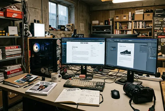
Launch-day storytelling eventually evaporates. Campaign films leave the feed, retail descriptions vanish and the product enters a less flattering record: tagged seasons, style codes, measurements, construction photographs and used garments showing where fabric creased, print fractured or hardware rubbed.
That afterlife points toward a better collaboration model. Future partnerships need fewer ceremonial logo exchanges and more defined reasons to exist. A footwear project might resolve fit or flex. An outerwear project might alter layering, weather protection or carrying capacity. A culturally led release might give genuine authorship to an illustrator, music scene or supporter community. Purpose can be physical or cultural, provided it remains legible in the object.
Intentional design also gives menswear a longer memory. Colour carries mood, affiliation and season, yet it rarely explains how a garment was built. New pattern architecture, unusual material behaviour and changed relationships between body and product can still be read when the campaign language has disappeared.
The archive check spans roughly three years of Autumn/Winter and Spring/Summer releases, preserving style codes, tagged seasons, measurements and sold-item construction photographs. What survives in that record is narrow: the collaborations still traceable are the ones that introduced new silhouettes and structural changes. A swapped colourway leaves behind a colour, and nothing else.