The Shifting Visual Language of 2013
Archival documentation confirms a stark visual baseline in late 2012. Menswear was drowning in wool flannel, raw denim, and waxed outerwear. The prevailing fantasy was the heritage workshop or the motorcycle garage. Vintage military references were visible everywhere, but they no longer felt like the only serious uniform. By mid-2013, that Americana-heavy aesthetic cracked.
I treat this era as a hinge year. The strongest visual contrast to earlier heritage dressing was not just silhouette, but location. Streets, stairwells, housing blocks, gymnasiums, and underlit city spaces replaced the cabin.
Gosha Rubchinskiy operated as the major disruptor in fashion photography and design during this window. He introduced post-Soviet codes that completely rewired the visual language of youth culture. Cyrillic lettering, track jackets, and shaved heads became the new standard. He pushed football-casual silhouettes that felt more aligned with the terraces of FC St. Pauli than traditional runway styling. Rubchinskiy cast kids who looked like local skate crews rather than conventional fashion models, placing them against bleak urban backdrops. This was a deliberate rejection of polished menswear.
Resurrections, Graphics, and Collaborations
Streetwear in 2013 recycled, distorted, and reissued cultural memory. Designers pulled old labels back into circulation, but rarely with polite reverence. The decisions organized around specific movements of graphic confrontation.
Take the unexpected resurrection of 1980s surf brand Life's a Beach. It returned with loud color, gross-out graphics, skulls, and flames. This was irreverent beach-punk energy rather than polite archival nostalgia. It demanded attention.
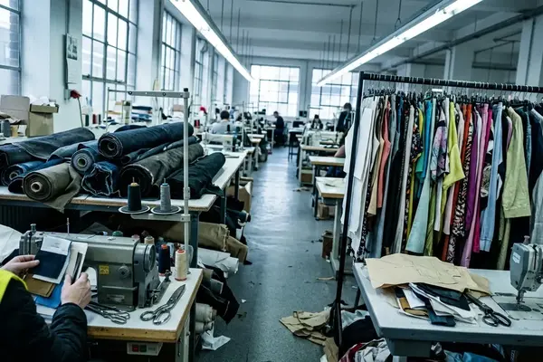
In Los Angeles, Born X Raised emerged to dominate the graphic t-shirt market. They made local displacement, gang-adjacent typography, and art-world name-checks feel like part of the same visual argument. References to Banksy, Basquiat, and Warhol worked less as museum homage than as streetwear sampling—recognizable art language rerouted through neighborhood identity and confrontational slogans.
Smaller capsules also defined the calendar. The November 2013 release of the Mr Vogel x Supremebeing collaboration operated as a tight, small-run graphic capsule rather than a mass-market brand reset. Meanwhile, Supreme's Nike Flyknit move pushed performance-knit footwear into a streetwear release context. This shifted attention away from the Mitchell & Ness retro basketball bulk that previously dominated the sneaker conversation.
The Soundtrack of the Streets
Visual shifts require an audio counterpart. Curated through an ongoing archival collaboration since 2019 with contributor Robert 'The Bossman' Boswell, we can map the year's defining underground and crossover music releases. These records explain the mood of the pavement.
Action Bronson had a massive year. His Saaab Stories EP dropped in June 2013, sharpening his Queens chef-turned-rapper persona. The record was packed with food detail, absurdist luxury talk, and bruising humor. By November, Blue Chips 2 arrived. The mixtape expanded the Bronson persona through free-associative samples, sports references, and unpolished energy.
Hip-hop dominance contrasted sharply with other underground textures.
- Forest Swords: Thor's Stone belongs to the darker edge of the year. It delivered dub pressure, smeared guitar textures, and haunted electronics rather than bright club functionality.
- Transplants: In A Warzone landed in June 2013. It brought a punk-rap aggression that connected naturally to graphic tees, shaved heads, and skate-adjacent styling.
Industry Takeaways and Future Trajectory
Synthesizing these shifts reveals a clear shift toward authenticity as the primary driver of brand survival. Industry veterans like Bobby Hundreds understood streetwear as a community-and-story business long before it became a wholesale category. His insistence on streetwear as a culture of participation, not just a logo-placement exercise, remains a key reference point.
The 2013 lesson was not simply that graphics returned. Graphics needed provenance. Whether it was Venice street politics, post-Soviet youth culture, punk-surf revival, or rap-world specificity, the references had to mean something to the people wearing them.
Key Takeaway: Trend-chasing became easier to spot because the references were highly precise. Cyrillic type, art-sampling tees, Flyknit performance texture, and retro basketball bulk each carried different, highly specific social signals.
This retrospective is strongest for menswear-facing, English-language streetwear circuits and should not be treated as a full account of every local scene, especially women-led, non-Western, or purely offline subcultures. Yet, within this specific ecosystem, 2013 proved that the market was increasingly dominated by highly specific subcultural references. The brands that survived were the ones that documented their own streets.