The Intersection of Subculture and Visual Art
I spend my days digging through flat files and archival boxes, tracing how visual culture moves from the street to the studio. If you want to understand the roots of contemporary streetwear, you have to look at the mid-1980s through the late 1990s. This was the core cultural window when underground skateboarding, hardcore punk, and hip-hop were still trading imagery before mainstream retail fully absorbed the look.
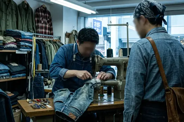
The artwork moved in a specific sequence. It started with skaters drawing directly on griptape. From there it bled onto shop flyers and photocopied zines. Eventually, it formalized into one-color deck graphics, clothing labels, and early desktop layouts. Mainstream commercial support was nonexistent. This forced a ruthless, highly inventive DIY approach to production.
Production conditions dictated the aesthetic. Small print runs were the norm. Artists hand-separated artwork and built photocopied layouts. Shop-made stickers and deck graphics had to survive being heat-transferred or screened onto curved wood. The visual shift becomes glaringly obvious across the first half of the 1990s. Analog paste-up and hand lettering began sharing space with early desktop typography, scanned photos, and cleaner mechanical layouts. The friction between these two methods defined the era.
Criteria for Selection: Defining the Underground Aesthetic
Selection starts with proximity. The strongest figures either skated, came out of graffiti or punk networks, shot the scene before it was useful to advertisers, or designed for companies operating close to the street level. Authenticity markers include DIY production, direct scene participation, and credited work in period skate media. We look for graphics made for boards, shirts, zines, stickers, or tour-style ephemera rather than gallery-first objects.
4. Don Pendleton’s Alien Workshop Language
Subversion is the second filter. You identify it through appropriation, fake corporate marks, altered film imagery, religious or state iconography, and tabloid violence. There is a deliberate misuse of clean modernist typography. Material cues are equally critical. We look for serigraph printing, photocopy degradation, hand-cut rubylith or film positives, marker and brush lettering, and paste-up layouts before full digital workflows became common.
Pro Tip:
A film-still tee, a hand-screened deck, and a Xerox zine page may share an underground attitude, but each has different production constraints, legal exposure, and routes into contemporary menswear. Do not conflate their origins.
Calling every rough black-and-white skate graphic "punk" flattens the historical record. It erases the difference between photocopy necessity, graffiti handstyle, surf-skate cartooning, hardcore flyer language, and later faux-vintage branding. Precision in categorization matters.
5 Pillars of 90s Skate Graphic Design
These five entries are ordered by function, not by importance. We move from documentary source material to punk-symbol language, streetwear appropriation, stylized board-world authorship, and finally, the afterlife of these motifs.
1. Glen E. Friedman’s Raw Documentation
Friedman’s skate, punk, and hip-hop photography spans from the mid-1970s into the 1990s. Books such as My Rules and Fuck You Too helped codify the high-contrast, confrontational documentary look. Later deck and apparel graphics repeatedly mined this archive for visual source material. His lens established the posture of the era.
2. Raymond Pettibon & The Punk Symbiosis
The four-bar Black Flag mark dates to the late 1970s hardcore scene. Created by Raymond Pettibon, it became a bridge between punk flyers, record sleeves, hand-drawn comics, and skate-deck aggression. Greg Ginn’s surrounding network helped push that visual code directly into the skate audience, cementing the crossover between the two subcultures.
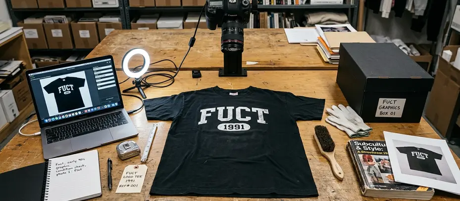
3. Erik Brunetti’s FUCT
The FUCT era crystallized in the early 1990s. The 1992 "Goodfellas" tee is widely cited in streetwear lore as an early counter-culture use of a film still on clothing. Brunetti turned cinematic theft into a graphic strategy—rather than a hidden reference. This blatant appropriation set the template for thousands of brands that followed.
Pendleton’s visual language matured around the late 1990s into the early 2000s. The "Photosynthesis" period tied into moody photography, restrained type, and post-punk references. This was a sharp departure from the louder cartoon grotesque common in earlier deck art. It proved that skate graphics could be atmospheric and intellectual.
5. The KR3W "Rights Refused" Afterlife
The 1980s and 1990s motifs kept mutating through later hands. Dennis McNett’s carved, mythic linework and French’s Kustom Kulture-inflected "Fast life, Slow Death" style turned skate graphics back toward handmade mark-making. They rejected the slick digital perfection that had started to dominate the industry.
Scope and Archival Limitations
The archive is kept deliberately tight around scenes where surviving evidence can be cross-checked. We rely on period magazines, shop catalogs, photographer captions, artist interviews, and dated garments. The most visible archival trail runs through California skate companies, US punk and hip-hop photography networks, and UK/London streetwear and music-adjacent graphics.
Early 1990s DIY material is notoriously difficult to pin down. Zines, bootleg shirts, shop stickers, and local flyer art were often unsigned. They were photocopied, reprinted, or altered between cities. Establishing a definitive chain of custody is often impossible.
This archival framing is strictly bound to US and UK material with surviving print documentation; local scenes in Japan, Brazil, Australia, and continental Europe followed entirely different production timelines and require separate methodological treatment.
Warning:
Treating nostalgia reissues as primary evidence will misdate the look. Modern nostalgia versions often smooth out the original damage. Cleaner scans, corrected spacing, softer garment blanks, safer slogans, and retail-friendly colorways replace the uneven ink, bad registration, and legal-risk energy of the source material.
The Lasting Impact on Contemporary Menswear
The legacy of 90s skate culture is traced through design behaviors rather than simple visual resemblance. Clipped photography, deadpan modernist type, bootleg logic, anti-authority slogans, and handmade distortion now appear across luxury runways and mall retail alike. Typography inherited from the period ranges from blunt Helvetica-style neutrality to Futura-like geometric restraint. Designers frequently pair these clean fonts with violent, absurd, or illegally borrowed imagery for maximum contrast.
You see this lineage not just in graphic tees, but in how a heavy wool flannel is styled, or how the terrace culture surrounding FC St. Pauli adopted the same anti-authoritarian visual codes. Even heritage sportswear brands like Mitchell & Ness eventually had to reckon with a consumer base raised on bootleg logic. The aesthetic demands a certain friction.
Archival validation usually comes from magazine ads, board catalogs, original photographer credits, and shop ephemera rather than from later social-media reposts. Independent retailers, bookshops, and small galleries continue to elevate this material. Through deadstock deck displays, artist print releases, photo-book programming, and capsule collections, they treat underground music and skate history with the rigor of fine art. The question remains: as these raw graphics are increasingly archived and commodified, do they lose the defiance that made them vital in the first place?