Build the Gig Poster from the Night Itself
How do you build an authentic two-colour gig poster from scratch when the easy option is another lifted punk flyer or anime still? Start inside the room. A cramped basement, an oversized figure and lettering drawn from the venue’s physical details give you something to work against. The tension belongs to this show.
I start with the image’s relationship to the night. A photograph made with the performers or a commissioned drawing can carry that relationship without borrowed distress marks doing all the cultural work. Underground scenes develop their own visual language through repeated, specific choices. Recycling somebody else’s archive makes different nights look interchangeable.
Secure written permission before preparing separations. Identify the artwork, payment, credit wording, permitted alterations, poster quantity, promotional uses and reprint permission. Agree whether cropping, halftoning and reducing the image to two colours are acceptable.
Keep merchandise rights separate: poster permission does not authorise the same image on shirts or record sleeves. For photography, establish ownership and approval rights with the copyright holder; the person pictured does not automatically own the photograph. Who can actually approve the image you are about to expose?
Make Two Separations That Survive the Pavement
Give the headliner and date the strongest first read. Group venue, doors, price and supporting acts into a coherent second read. Put essential information on the black separation so its legibility stays independent of the orange field’s coverage.
Print the layout at actual size, walk across the room, then inspect it under dimmer light. Hairline serifs, narrow counters and tight tracking become liabilities when ink closes the gaps. Open the lettering before adding distress. A rough image can tolerate broken texture; a door price needs intact characters.
Spread Orange Beneath Black
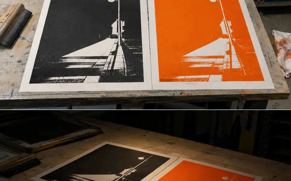
Where the colours meet, extend the lighter shape beneath the darker edge. A 0.2–0.4 mm spread gives a practical starting trap, closing the paper sliver that slight misregistration can expose. Inspect a test before applying that allowance throughout the design; small counters need particular attention.
Build intended overlaps as shared printing areas on both films. A knockout removes the underlying ink. Keep matching registration crosses outside the finished image, then mask their stencil openings before production.
Opaque black can conceal the orange underneath, so approve a dried overlap swatch on production stock before treating that crossing as a third colour. Judge the print, rather than the glowing preview.
Spend on a Stable Bench and a Readable Stencil
Repeatable positioning deserves the equipment budget. Bolt hinge clamps to a heavy, rigid workbench. Check an aluminium or sturdy wooden frame for rocking, inspect mesh tension, and choose a straight polyurethane squeegee with an undamaged edge. Every loose component adds another movement to control.
- Broad shapes and heavier deposits: start around 43–55 threads/cm, approximately 110–140 threads/inch.
- Finer lettering and halftones: around 77–90 threads/cm, approximately 195–230 threads/inch, supports finer detail with a thinner deposit.
Write the units down. “110 mesh” leaves room for confusion between suppliers using different counting systems. Start with coarse halftones and include the smallest dots and narrowest counters in the exposure test. Their survival through exposure and printing determines the usable detail.
Expose for the Emulsion
Coat both screens with emulsion suitable for water-based ink and dry them in darkness. Hold dense positive films firmly against the coating. Match the halogen or UV source to the emulsion’s spectral requirements, then record lamp distance and the successful exposure setting for the second screen.
Test ink on the actual stock batch. Transparent base reduces hiding power and lets paper and underlying ink contribute more to the overlap. Treat that as a colour decision. Organise ventilation and cleanup around the ink maker’s instructions and the occupational safety guidelines for printing inks and solvents.
Lock the Black Screen to the Orange Print
A dry orange print, a hinged acetate sheet and three low-profile stops give you a registration system you can inspect directly—without guessing through a raised screen.
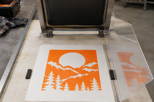
- Place two cardboard or Mylar tabs along one long sheet edge and one along the adjacent short edge.
- Tape acetate to the platen as a hinge. Print the black image onto it, lift it, and position a dry orange sheet underneath.
- Lower the acetate. Adjust the screen or stops until the images align, then lock the setup.
- Trial off-contact around 1–3 mm above the stock with equal, measured shims. Secure coins or cardboard outside the image and paper path.
The mesh should release immediately behind the blade. Excessive flood pressure can force ink through the stencil before the print stroke, producing bleeding. Refill the image lightly; use the print stroke to transfer ink and clear it.
During pauses, leave the image flooded and follow the ink maker’s cleaning guidance. Random water additions alter viscosity. If a sheet lifts with the screen, check tacky ink, incomplete mesh release and static separately. Ground suitable metal equipment and avoid vigorous dry wiping of plastic. Support wet card on shelves with circulating air, away from a hot blast.
Print Fifty Orange-and-Black Posters for Friday
For the local Friday basement lineup, use A3 cream uncoated card, 297 × 420 mm, at 250 gsm. Prepare 50 production sheets and five sacrificial setup sheets from the same batch. Orange carries the large image field; deep black carries the halftone key image and every piece of gig information.
- Set the orange station. Tape down the three registration tabs, secure equal coin shims and check mesh release. Use the sacrificial sheets to settle position and ink deposit against the approved dried swatch.
- Pull the orange layer. Print across all 50 production sheets, keeping the stroke consistent. Place each sheet on supported drying shelves. Wash ink from the first screen immediately, before it dries in the mesh.
- Register the black key. Once orange is dry to the touch, print black onto the hinged acetate. Align it over a dry orange sheet, lock the stops and check the trapped edges and small lettering on setup stock.
- Run the black. Begin trials with the squeegee approximately 45 degrees to the bed. Once the stencil clears cleanly, hold angle, speed and pressure steady. Check counters, halftone dots and orange-black crossings as sheets leave the platen.
- Finish the edition. Keep ventilation running through the ink maker’s handling and full-drying requirements. Once fully dry, send posters to record-shop windows and authorised posting surfaces. Retain a clean copy with the separation files: Friday’s lineup, lettering and room now have their own place in the archive.